deviant art

Deviant Login Shop  Join deviantART for FREE Take the Tour
[x]
Download Image
PNG, 960×1390
more ▶

More from ~Misakochan

Featured in Groups:

Details

May 12, 2006
1.2 MB
960×1390
Link
Thumb

Statistics

Comments: 13
Favourites: 36 [who?]

Views: 1,619 (0 today)
Downloads: 577 (0 today)
[x]
:iconmisakochan:
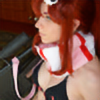
yes! Finally finished =3
1 down xDD

This is for for winning the little caption contest for one of my pics ^^
Had lots of fun doing this since I got to test my new comp and fixed table with it
Hope you like it!


-sorry for the second upload, I wanted to edit something small, but my comp was annoying and wouldn't just edit the pic e.e
Add a Comment:
 
love 0 0 joy 0 0 wow 0 0 mad 0 0 sad 0 0 fear 1 1 neutral 0 0
:iconkero-sempai:
Mood: Distressed ~Kero-sempai Mar 6, 2009   General Artist
The light is so pretty! How did you make it do that? Those swirls of light are just SO COOL...!!! Please tell me how you made it do that! :puppy dog eyes:
Come look at my gallery if you like Krad and Satoshi. There's more coming soon! :shamelessly advertising the doujinshii:
Reply
:iconromanletters:
Krad has a big head? But I really love the wings... They are really nice! And Krad has the I'm-a-possesive-bastard!-look, and I love it. Especially how it contrats against Satoshi's I-don't-want-this-but-I-still-want-him-look. ^^ And Krad's clothes are sooooo pretty! Also, loves his hands, their hands. Yay! Really good work!
Reply
:iconsatodai:
I love how their hair looks ^^
Reply
:iconsokkashot:
Krad looks a bit strange, and Satoshi needs to grow but this is definatly fgoin in :+fav:s
Reply
:iconmisakochan:
lol yeah...Krad's hair is down and his head is too big which makes Satoshi look small >.< *doesn't really like this pic* lol
but thanks anyway =3
Reply
:iconsokkashot:
aw, don't worry it's a bazillion times better than my drawing on Krad!
Reply
:icondaosx:
~DaosX May 16, 2006  Professional Traditional Artist
Thank you for posting on my thread

From this picture, I can only see 3 noticeable flaws. Firstly, the character in green's head is too big in proportion to the rest of his body. You can actually fix this by using the lasso tool and selecting the head, copy it on a new layer, reduce the size, then paint over the bottom layer with clothing. Secondly, his forearm is too short in proportion to his...uhh...biceps? Whatever that part of the arm is called. Lastly, and probably the most noticeable part is his hands, fingers specifically which look too skinny as well as flat. I see you attempted to give it volume by using the shadows and the blur but if you looked at the fingers (the index one specifically), you'd see what I mean.

Other than that, it's a wonderful composition.
Reply
:iconmisakochan:
oh yeah, I should've mentioned that I really rushed the hands and didn't put any care at all into them what so ever lol, but thanks so much for telling me how to fix the head =3 Thats certianly one of the best critiques I've had. No one ever tells me how to fix the problem e.e;;
I'm glad you like the composition though, I find that to be the most important. Anatomy is something that you can know and still just mess something up different in each picture. ^^;
Reply
:iconrikurose88:
~rikurose88 May 15, 2006  Hobbyist Traditional Artist
i love it!! thank you so much!! :glomp: it is very cool! and i'm glad you had fun with it.
Reply
:iconmisakochan:
aww, thanks ^^ I'm glad you like it =)
Sorry it took though =<
Reply
Add a Comment: